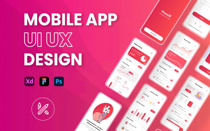
1. Emphasize on Minimalism
- Be neat and clean: Don't clog the space with too much information or content.
- Use as little as necessary to get across the key feature.
- Adopt the "one screen, one purpose" paradigm.
2. Establish a Consistent Design Language
- Be consistent in terms of color usage, fonts, button styles, and spacing
- Comply with platform-specific design guidelines
- Material Design for Android
- Human Interface Guidelines (HIG) for iOS
3. Design for Touch
- Make all tappable elements touchable (greater than or equal to 48x48 pixels).
- Keep interactive elements far enough apart so that accidental taps are unlikely.
- Consider thumb-friendly zones, especially for one-handed use.
4. Visual Hierarchy
- Use size, color, contrast, and alignment to guide the user's attention.
- Make key actions stand out (e.g., "Buy Now" or "Login") with prominent buttons or bold colors.
- Group related content in a logical way.
5. Accessibility
- Use readable fonts (at least 16px for body text).
- Provide sufficient contrast between text and background for readability.
- Support screen readers and label all interactive items.
- Add gestures for people who have motor impairment.
6. Flexible Design
- User interface should display well on diverse screen sizes and resolutions.
- Check designs on many devices to be sure they appear consistent and accessible.
7. Use Intuitive Navigation
- Stay with the conventions, like a bottom navigation bar or side menus.
- Avoid long navigation levels and confuse users
- Use icons of meaning with text label
8. Reduce Load Time
- Optimize images and videos to enhance performance.
- Use loading animations or progress indicators to inform users of delay.
9. Provide Feedback for Actions
- Use visual or tactile feedback when elements are interacted with (e.g., button press animations).
- Use clear and actionable error messages and success confirmations.
10. Test and Iterate
- Conduct usability testing on real users to identify issues and gather feedback.
- Use A/B testing to figure out which design elements work best.
- Continuously iterate and improve based on analytics and user input.
11. Use Animation Sparingly
- Add animations to guide user actions and enhance the experience.
- Avoid too many or unnecessary animations that may distract or slow down interactions.
12. Incorporate Personalization
- Offer users customization options (e.g., themes or layouts).
- Leverage data to provide personalized experiences, such as tailored recommendations.
13. Design for Offline Use
- Plan for scenarios where users may have limited or no internet access.
- Cache core data and give more relevant offline messages.
14. Scalability
- Plan for future growth in features and content.
- Ensure the UI can scale to accommodate additional functionality that doesn't compromise design integrity.
15. Security Best Practices
- Avoid leaking sensitive data through the UI.
- Provide feedback for secure actions like login or payment.


No comments:
Post a Comment