Thursday, 9 January 2025

How to Choose the Right Graphic Design Style for Your Project


1. Purpose of the Project

  • Key Questions to Ask Yourself
  • What's the message that you want to deliver?
  • What do you want the project to achieve for you? Whether it is a branding, marketing, or education initiative.
  • Defining Success: Establish what the metrics of success will be-brand awareness, click-through rates, or emotional connection.

2. Identify Your Target Audience

  • Identify demographics-age, gender, location-and psychographics-interests, preferences, and values.
  • Tailor the style to resonate with your audience. For example, a bright, playful style might be perfect for a younger audience, while a minimalist and sleek approach may appeal to professionals.

3. Align with Brand Identity

  • Ensure the design style aligns with your brand's core values, tone, and guidelines.
  • If your brand is modern and innovative, a futuristic design might be suitable. For an eco-friendly brand, consider organic, nature-inspired aesthetics.

4. Competitor and Industry Trend Research

  • Observe your competitors to see what trends and styles are popular in your industry.
  • Be unique but relevant.

5. Graphic Design Style Options

  • Minimalist: Very clean and simple with lots of white space. Ideal for modern, professional work.
  • Illustrative: Hand-drawn or custom illustrations give a personal, creative feel.
  • Retro/Vintage: Nostalgic and ideal for products that appeal to certain eras.
  • Flat Design: Simple, two-dimensional visuals, bright colors. Excellent for digital and web projects.
  • 3D Design: Adding depth realism best for innovative or futuristic ideas.
  • Typography-Based: Unique styles and arrangements of the fonts represent a text-driven approach.

6. Select Your Colors and Fonts with Care

  • Select a color palette that advances the tone of your project (for example, bold colors for excitement, muted tones for sophistication).
  • Use fonts that are readable and relevant to the atmosphere you wish to create.

7. Test and Get Feedback

  • Develop mockups or prototypes to test different styles.
  • Get feedback from stakeholders and target audience to refine the design.

8. Stay Flexible and Iterative

  • Be willing to adapt the style as your project evolves.
  • Balance creativity with functionality to ensure the design meets its purpose.


"Find Out What Your Website’s Missing – Let’s Talk Today"

Wednesday, 8 January 2025

The Importance of Consistency in Graphic Design


Consistency in graphic design is an important factor that helps in creating effective, memorable, and professional-looking visuals. Be it designing for a brand, a campaign, or personal projects, maintaining consistency ensures that your design communication is clear and stays relevant to the target group.


1. Develops Strong Brand Identity

  • Use logos, colors, fonts, and other design elements consistently to give a recognizable face to your brand. This assures your audience instantly associates your images with your brand, which then boosts brand recall and loyalty.

2. Gains Professionalism

  • Inconsistencies may look messy and not refined at all. Your professionalism and commitment to details speak volumes when keeping your style unified throughout your media.

3. Efficient Communication

  • Consistency in design makes message communication easier and more straightforward. A consistent look and feel keep the attention guided and focused where it should go, without unnecessary diversions to noise.

4. Facilitates Useability and Access

  • Consistency in digital domains such as the web and application interfaces enhances useability. By making interfaces predictable and intuitive, consistency is valuable for accessibility too.

5. Saves Time and Resources

  • Having set guidelines about consistency, a style guide reduces the complexity involved in the process of designing. Teams can focus on other things more efficiently without coming up with repetitive decisions on issues like colors and typography for new projects.

6. Emotional Connectivity

  • Consistent design creates a sense of familiarity, which further leads to connections with your target audience. More time spent does this, however, and brings about trust and loyalty.

How to Maintain Consistency in Design

  • Develop a Style Guide: Document your brand colors, typography, iconography, and tone of visuals.
  • Use Templates: Templates for social media, presentations, or reports ensure uniformity across different platforms.
  • Collaborate Effectively: Ensure all team members understand and adhere to the design guidelines.
  • Regularly Review Designs: Audit your visuals periodically to ensure they align with your brand identity.

Tuesday, 7 January 2025

The Psychology of Colors in Graphic Design


1. Color Psychology Importance

  • Stirring Emotions: Colors can elicit feelings of serenity, excitement, or trust.
  • Driving Decisions: Color can influence behavior, such as to click or buy.
  • Brand Identity: Colors are part of what make a brand's personality and message.

2. Meaning of Colors in Graphic Design

The following are general associations for various colors, although cultural differences can vary the meaning:

Red

  • Emotion: Passion, energy, urgency, love.
  • Use: Call-to-action buttons, sales promotions, food brands.
  • Examples: Coca-Cola, Netflix.

Blue

  • Emotion: Trust, serenity, professionalism, security.
  • Applications: Corporate branding, health care, and technology.
  • Examples: Facebook, LinkedIn, Samsung.

Yellow

  • Emotion: Happiness, optimism, caution.
  • Applications: Youth-oriented brands, warning signs, and cheerful designs.
  • Examples: McDonald's (with red), Snapchat.

Green

  • Emotion: Nature, growth, health, wealth.
  • Applications: Eco-friendly brands, wellness, and financial institutions.
  • Examples: Starbucks, Whole Foods, Animal Planet.

Purple

  • Emotion: Luxury, creativity, wisdom, spirituality.
  • Applications: Beauty products, luxury items, and creative industries.
  • Examples: Cadbury, Yahoo.

Black

  • Emotion: Sophistication, elegance, power.
  • Applications: High-end brands, minimalist designs, and formal themes.
  • Examples: Chanel, Nike.

White

  • Emotion: Simplicity, purity, cleanliness.
  • Applications: Modern designs, healthcare, minimalism.
  • Examples: Apple, most pharmaceutical branding.

Orange

  • Emotion: Energy, playfulness, excitement.
  • Applications: Sports, children's products, food brands.
  • Examples: Fanta, Nickelodeon.

Pink

  • Emotion: Femininity, romance, youthfulness.
  • Applications: Beauty, fashion, children's products.
  • Examples: Barbie, Victoria's Secret.

Gray

  • Emotion: Neutrality, balance, professionalism.
  • Applications: Backgrounds, corporate designs, tech brands.
  • Examples: Apple (accent), neutral color schemes.

3. Tips for Using Colors in Graphic Design

  • Understand the Target Audience: Research cultural and demographic factors to ensure the color scheme resonates with the audience.
  • Stick to Brand Guidelines: Use colors that align with a brand's established identity.
  • Limit the Palette: Use a primary color with complementary accents to maintain clarity and focus.
  • Leverage Contrast: Use contrasting colors to draw attention and enhance readability.
  • Test and Analyze: A/B test designs to determine how different colors impact user engagement and behavior.

4. Cultural Considerations

  • Red: In Western cultures, it symbolizes love or danger; in Eastern cultures, it represents luck and prosperity.
  • White: Represented as purity in Western cultures but is more often associated with mourning in many Asian cultures.
  • Green: Represents nature in most cultures but can symbolize jealousy in others.

Monday, 6 January 2025

The Role of Graphic Design in Marketing Campaigns


1. Brand Identity Strengthening

Consistent Branding: Graphic design makes sure that logos, colors, typography, and visual styles are uniform across all marketing materials.

Recognition: Good graphic design is known to make memorable visuals so that a brand is easily recognizable and relatable.

Trust Building: Marketing assets professionally designed create an aura of credibility and professionalism.

2. Attention Capture

First Impressions: Visuals can help marketing campaigns stand out in a competitive landscape.

Storytelling: Infographics, videos, and illustrations help convey complex messages quickly and effectively.

Emotional Appeal: Colors, forms, and forms move the viewer emotionally.

3. Effective Transmission of Messages

Simplification of Information: Graphic designing tries to transform data into appreciable, easy-to-understand forms such as infographics, charts, and diagrams.

Clarity: Well-designed layouts and visuals ensure that marketing messages come out clear and powerful.

Call-to-Action: Design elements such as buttons, banners, arrows guide users in taking the desired action.

4. Increasing Engagement

Social media: Images from posts, stories, and ad units draw eyes to Instagram and Facebook as much as to any click or Pinterest post, including commenting.

Content Marketing: Illustration on eBook/Whitepapers Blog images make all your readers go there and return there again.

Interactive Elements: An animated version or interactive graphical form boosts the overall interaction.

5. Cohesion for the campaign

Common Identity: Graphics glue a whole project's pieces-the banner to display digital, leaflet for in-the-flyers.

Cross-Channel Presence: Ensures consistency across online and offline platforms, reinforcing the campaign’s message.

Adaptability: Designs are tailored for specific mediums, ensuring effectiveness in print, digital, or environmental displays.

6. Supporting Digital Marketing

Web Design: A visually appealing and user-friendly website boosts SEO and conversions.

Email Campaigns: Custom-designed templates make emails more engaging and professional.

Video Marketing: Motion graphics and animations elevate video campaigns.

7. Driving Conversions

Persuasive Design: Strategic placement of elements like CTAs (Call-to-Actions) encourages users to act.

Psychological Triggers: Colors, fonts, and layouts can influence consumer decisions.

A/B Testing: Graphic elements can be tested to determine what works best for driving sales or sign-ups.

Examples of Graphic Design in Marketing Campaigns

Logos and Branding: Coca-Cola's iconic logo or Nike's swoosh instantly connect with their target audience.

Social Media Graphics: Infographics published on Instagram or Pinterest become a viral sensation because of their visual appeal.

Print Marketing: Flyers, brochures, and posters in line with the digital campaign remind the message through offline media.

Video Graphics: Motion graphics in video advertisements keep viewers engaged and enhances the recall value.

Graphic Design Best Practices in Marketing

Know Your Audience:


Designs are tailored to meet the preferences and behaviors of the target audience.

Simplicity is the focus:


Use minimalism: Simplify the bigger message by keeping it clear and of elegance.

Utilize Brand Guidelines:


Use the defined colors, fonts, and imagery that the brand has established.

Prioritize Responsiveness:

Ensure that designs are great on all devices, especially for digital campaigns.

Test and Optimize

Use information-driven insights to refine graphics to better create more engagement and conversion.


Thursday, 2 January 2025

How to Design an Eye-Catching Poster


1. Define Your Objective

Determine the purpose of the poster (e.g., event promotion, product advertisement, informational).

Identify your target audience to tailor the design.


2. Choose the Right Size and Layout

Select a standard poster size (e.g., A4, A3, 24"x36").

Opt for portrait or landscape orientation based on your content.


3. Use a Strong Headline

Create a bold and concise headline that grabs attention.

Use large, readable fonts (e.g., sans-serif fonts like Helvetica or Futura).


4. Choose a Visual Hierarchy

Headline first, then subheadline, and finally body copy.

Use size, color, and placement to lead the reader's eye.


5. Use High Quality Images

Clear, relevant pictures, illustrations, or graphics

Ensure images enhance your message and brand


6. Select a Consistent Color Scheme

2-3 dominant colors

Use contrasting colors for text and background to improve readability


7. Utilize White Space

Avoid clutter by leaving enough white space around elements.

White space can make the poster look clean and professional.


8. Typography Matters

Use no more than 2-3 fonts to keep it simple.

Text should be readable from a distance.


9. Add a Call-to-Action (CTA)

Add actionable steps like "Visit us," "Buy now," or "RSVP here."

Make the CTA stand out with bold text or a button design.


10. Add Branding

Add your logo, company name, or tagline.

Use your brand's colors and fonts for consistency.

11. Proofread and Test

Spelling, grammar, and layout check

Print a test copy to see how it will look in life

12. Optimize for Digital

Export at high resolution (e.g., 300 DPI for print, 72 DPI for web)

Ensure social media compatibility.


Wednesday, 1 January 2025

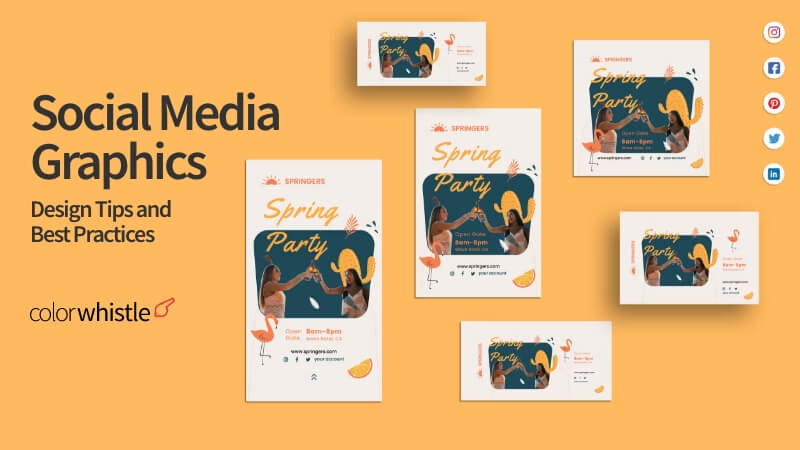
Best Practices for Creating Social Media Graphics


1. Know the Requirements of the Platforms

Aspect Ratios and Dimensions: Use the suggested dimensions by each platform to ensure your graphics are professional and aren't cropped or pixelated.

Instagram :1080 x 1080 px square; 1080 x 1920 px stories

Facebook: 1200 x 630 px

Twitter: 1600 x 900 px

Pinterest: 1000 x 1500px

File Types: Use high-quality files such as PNG or JPEG in case images and MP4 for videos


2. Use a Consistent Branding

Color: Stay true to your brand's color palette.

Typography: Use fonts that reflect your brand. Limit your fonts to 2–3 for a clean look.

Logos: Place your logo discreetly to reinforce brand awareness.


3. Visual Hierarchy

Focus attention on important elements, such as headlines, CTAs, or special offers.

Use contrasting colors to draw attention to important elements.

White space will help avoid clutter and improve readability.


4. High-Quality Images and Icons

Use sharp, high-resolution images and icons.

Avoid using stock images that are too common or clichΓ©d; instead, use original illustrations or photographs.


5. Be Text-Image Aware

Use text sparingly, ideally to 20–30% of the graphic space, for better readability and less distraction.

Use bold and readable text, especially for smaller mobile screens.


6. Accessibility

Use readable fonts and sufficient font sizes.

Add alt text or captions for users with disabilities.

Use color combinations with enough contrast for readability.


7. Test Animation and Motion Graphics

Add subtle animations or GIFs for dynamic engagement.

Ensure the motion does not overwhelm the message or distract the audience.


8. Use Tools and Templates

Tools like Canva, Adobe Express, and Figma offer ready-to-use templates for social media.

Adapt templates to fit your brand guidelines while saving time.


9. Plan Content for Each Platform

Customize graphics according to the tone and audience of each platform, like fun and vibrant for Instagram, professional for LinkedIn.

Test A/B versions to see what works best.


10. Keep an Eye on Trends

Keep track of visual trends (minimalism, bold typography, vibrant gradients, etc.).

Use trending elements while keeping your graphics timeless to avoid rapid obsolescence.


Tuesday, 31 December 2024

How to Design for Different Screen Sizes and Resolutions


 1. Know Responsive and Adaptive Design

Responsive Design: Flexible grids, layouts, and CSS media queries adapt to all screen sizes.

Adaptive Design: Different layouts are designed for specific screen sizes or resolutions.

2. Mobile-First Approach

Design for the smallest screen size first and then scale up for larger screens.

This way, the most important features are accessible and usable on mobile devices.

Example:

Start with a 360px wide layout for smartphones.

Expand to tablets, desktops, and larger displays.

3. Flexible Grid System

Use CSS Grid or Flexbox for layout structures.

Set widths and heights in percentages or relative units (e.g., em, rem, vh, vw) instead of fixed pixels.

Example CSS Grid:

css

Copy code

.container {

display: grid;

grid-template-columns: repeat(auto-fit, minmax(300px, 1fr));

}

4. Media Queries

Media queries allow you to apply different styles based on screen size and resolution.

Example:

css

Copy code

@media (max-width: 768px) {

body {

font-size: 14px;

}

}

@media (min-width: 769px) {

body {

font-size: 16px;

}

}

5. Optimize Images and Graphics

Use responsive image techniques:

The srcset attribute to provide different image sizes for different screen resolutions.

Example:

html

Copy code

<img src="small.jpg" srcset="medium.jpg 768w, large.jpg 1200w" sizes="(max-width: 768px) 100vw, 50vw" alt="Responsive Image">

Use the next-gen formats like WebP for the purpose of better compression and faster loading.

6. Scalable Typography

Scale the font sizes through the relative units such as em or rem.

Media queries should be used to make a size change in case of a larger screen.

Example:

css

Copy code

body {

font-size: 1rem; /* Base size */

}

@media (min-width: 1200px) {

body

font-size: 1.25rem;

}

7. Touch-Friendly Elements

Make sure that buttons and interactive elements are big enough for touch screens.

Minimum size: 48px x 48px according to Google Material Design.

Provide sufficient spacing between touch elements to prevent accidental taps.

8. Testing on Real Devices and Emulators

Browser developer tools are used to test responsiveness.

Chrome DevTools: Ctrl+Shift+M (Windows) or Cmd+Shift+M (Mac).

Test on real devices for proper performance, including smartphones, tablets, and desktops.

Tools:

BrowserStack: Cross-device testing.

Responsinator: Visualize your design on different devices.

9. Use Responsive Frameworks

Utilize frameworks like Bootstrap, Foundation, or Tailwind CSS for pre-made responsive components.

Example: Bootstrap Grid System

html

Copy code

<div class="container">

<div class="row">

<div class="col-sm-12 col-md-6">Column 1</div>

<div class="col-sm-12 col-md-6">Column 2</div>

</div>

</div>

10. Reduce and Refactor for Performance

Eliminate unnecessary graphics and scripts.

Lazy-load images and videos.

Cache and compress using Gzip and Brotli

11. Design for Accessibility

Utilize a color contrast ratio that satisfies the WCAG requirements.

Keyboard, and screen reader navigation is also taken care of

HTML used should be semantic so that it can work well in different devices

12. Plan for Future Devices

Design flexible according to the availability of the new screen sizes, such as foldable phones or ultra-wide monitors.

Use min, max, and clamp in CSS for more adaptive layouts.

Screen Size and Resolution Breakpoints (Common Standards)

Type of Device\tScreen Width in Pixels

Mobile Phones\t320px – 480px

Tablets\t481px – 768px

Small Laptops\t769px – 1024px

Desktops\t1025px – 1920px

Large Displays\t1921px and above