Friday, 31 January 2025

𝐇𝐨𝐰 𝐭𝐨 𝐖𝐨𝐫𝐤 𝐰𝐢𝐭𝐡 𝐃𝐢𝐟𝐟𝐞𝐫𝐞𝐧𝐭 𝐅𝐢𝐥𝐞 𝐓𝐲𝐩𝐞𝐬 𝐢𝐧 𝐆𝐫𝐚𝐩𝐡𝐢𝐜 𝐃𝐞𝐬𝐢𝐠𝐧


Compatibility, quality, and the desired final output can be ensured in graphic design only if one is working with various file types. Here's a guide on how to handle various file types effectively:


1. Raster vs. Vector Files

  1. Raster Files (Bitmap Images)

  • Formats: JPEG, PNG, GIF, TIFF, PSD
  • Made of pixels, resolution-dependent (scaling can cause pixelation).
  • Best for digital images, web graphics, and photo editing.
  • Use TIFF or PSD for high-quality images.
  • Use PNG for transparent backgrounds.

Vector Files

  • Formats: AI, EPS, SVG, PDF
  • Comprises paths; resolution-independent (scalable without loss of quality).
  • Best used for logotypes, icons, illustrations.
  • AI is the main vector file format
  • SVG is very common for web graphics


2. Basic File Formats Knowledge

JPEG (.jpg/.jpeg)

JPEG

  • Best for photographs and web use
  • Lossy compression means the image quality loses a percentage with every save
  • Do not make it good for transparency or any kind of print

PNG (.png)

  • Transparency can be used
  • Lossless compression is far better than JPEG
  • PNG is common usage for web graphics and digital design

GIF (.gif)

  • Supports simple animations.
  • 256-color only, which is not perfect for high-definition images.
  • For small web animations and simple graphics.

TIFF (.tif)

  • High-quality lossless format.
  • Professional printing and high-resolution images.
  • It's a big file, and hence it's not good for the web.

PSD (.psd)

  • This is Adobe Photoshop's native format.
  • Layers, transparency, and all that good stuff are supported.
  • Good for detailed graphic editing.

AI (.ai)

  • Adobe Illustrator's native format.
  • Perfect for creating and editing vector graphics.
  • Used for logos, illustrations, and print designs.

EPS (.eps)

  • Multiple design software compatible in vector format.
  • Ideal for professional printing and graphics that can be scaled.
  • Generally used for logos and branding material.

SVG (.svg)

  • XML-based vector format for web and digital use
  • Scalable without losing the quality
  • Commonly used in web design and responsive graphics.

PDF (.pdf)

  • Format for both raster and vector elements.
  • Ideal for print and digital documents.
  • Formatting remains the same in different devices.


3. Selection of File Format

  • For Web & Digital Use → JPEG, PNG, GIF, SVG
  • For Print Design → TIFF, PDF, AI, EPS
  • For Editing & Layered Files → PSD, AI


4. Best Practices

  • Always work with the highest quality files to avoid loss of resolution.
  • Use vector formats for logos and illustrations to keep them scalable.
  • Save multiple versions (editable + export format) for flexibility.
  • Convert files appropriately when sharing with clients or printers.

"Let’s Create Your Website-Contact Us Now!

Wednesday, 29 January 2025

𝐇𝐨𝐰 𝐭𝐨 𝐈𝐧𝐜𝐨𝐫𝐩𝐨𝐫𝐚𝐭𝐞 𝐏𝐡𝐨𝐭𝐨𝐠𝐫𝐚𝐩𝐡𝐲 𝐢𝐧𝐭𝐨 𝐆𝐫𝐚𝐩𝐡𝐢𝐜 𝐃𝐞𝐬𝐢𝐠𝐧


Incorporating photography into graphic design can add depth, realism, and emotional appeal to your designs. Here’s how you can effectively blend the two:

1. Choose High-Quality Photography

  • Use high-resolution images to maintain clarity.
  • Select photos with good lighting and composition.
  • Ensure the images match the theme and message of your design.

2. Create a Visual Hierarchy

  • Use photography as a focal point to guide the viewer’s eye.
  • Balance text and images so they complement each other.
  • Apply cropping techniques to remove distractions.

3. Blend with Graphic Elements

  • Overlay shapes, textures, or typography onto photos.
  • Use masks and transparency effects to integrate elements smoothly.
  • Experiment with double exposure or collage effects.

4. Maintain Brand Consistency

  • Use a consistent color palette and filters.
  • Ensure fonts and styles align with brand identity.
  • Stick to a uniform tone and mood.

5. Edit & Enhance with Software

  • Adjust brightness, contrast, and saturation for visual harmony.
  • Remove unwanted elements using tools like Photoshop.
  • Apply filters or gradients to unify the design.

6. Use Photography for Backgrounds

  • Subtly blurred or minimalistic photos make great backdrops.
  • Ensure backgrounds don’t overpower the main content.

7. Add Motion for Dynamic Designs

  • Combine photography with animation or parallax effects.
  • Use cinemagraphs or animated overlays to enhance engagement.

"We Can Help You Build Your Website – Contact Us Now!"

𝐔𝐧𝐝𝐞𝐫𝐬𝐭𝐚𝐧𝐝𝐢𝐧𝐠 𝐭𝐡𝐞 𝐑𝐨𝐥𝐞 𝐨𝐟 𝐚 𝐆𝐫𝐚𝐩𝐡𝐢𝐜 𝐃𝐞𝐬𝐢𝐠𝐧𝐞𝐫 𝐢𝐧 𝐏𝐫𝐨𝐝𝐮𝐜𝐭 𝐏𝐚𝐜𝐤𝐚𝐠𝐢𝐧𝐠


1. Brand Identity & Consistency

Graphic designers maintain the identity of the brand through different products with color, typography, and visual elements. They make sure packaging also supports the branding of the company, which enhances the recognition of a brand.


2. Grabbing Consumer Attention

The product packaging has to be so captivating within an outstanding competitive marketplace. Graphic designers apply color psychology, various font selection, and creative design elements so that the product appears attractive visually.


3. To Convey Product Information

A well-designed package should clearly indicate essential information like the name of the product, features, benefits, and usage instructions. Designers plan to place text and icons in such a manner that it makes the information accessible.


4. User Experience

Packaging has to be aesthetically functional and user-friendly. Designers will consider the relationship between consumers and the packaging - easy opening designs, clear labelling, and intuitive layout help improve the experience.


5. Differentiation & Market Positioning

Graphic designers help the product position itself in the market by creating a unique visual identity. Whether it is luxury, eco-friendly, or budget-friendly, packaging design has a significant impact on consumer perception.


6. Legal & Industry Standards

Packaging should adhere to legal standards, such as ingredient lists, barcodes, safety warnings, and sustainability information. Designers should ensure that all the necessary details are added without compromising aesthetics.


7. Sustainable & Eco-Friendly Packaging

With growing environmental concerns, designers decide on sustainable materials, minimalistic designs, and biodegradable packaging in accordance with eco-conscious consumer preference.


8. Flexibility in Format

A product can have different variations of packaging such as single-use packs, bulk packaging, or even digital mockups. Graphic designers adapt the designs for various formats without compromising the brand consistency.


9. Creating Emotional Connections

Great packaging design stirs emotions and tells a story. Whether it is in the form of vintage styles, minimalist approaches, or playful illustrations, designers connect with consumers on an emotional level.


10. Supporting Marketing & Advertising Efforts

Packaging is part of a product's marketing strategy. A well-designed package acts as a silent salesperson, enticing customers and influencing purchasing decisions even before they read promotional material.

"We Can Help You Build Your Website – Contact Us Now!"

Tuesday, 28 January 2025

𝐓𝐡𝐞 𝐈𝐦𝐩𝐨𝐫𝐭𝐚𝐧𝐜𝐞 𝐨𝐟 𝐕𝐢𝐬𝐮𝐚𝐥 𝐇𝐢𝐞𝐫𝐚𝐫𝐜𝐡𝐲 𝐢𝐧 𝐆𝐫𝐚𝐩𝐡𝐢𝐜 𝐃𝐞𝐬𝐢𝐠𝐧


1. Improves Readability and Legibility

Visual hierarchy ensures that content is readable and comprehensible by the viewer. The elements are presented in a sequence of importance, where the key message is highlighted while the supporting content is secondary.

  • Example: Using large, bold fonts for headlines and smaller fonts for body text separates the main message from the supporting content.


2. Controls Viewer Attention

Visual hierarchy guides the viewer to what parts of the design are the most important so that they would look at the very important parts first.

Methods Employed:

  • Size-darker objects take up more space.
  • Color-high contrast or bright colors draw to it.
  • Placement-things placed at the top or in the center tend to draw the eye first.


3. Adds Emotional Resonance

Ellicit the right kind of emotional response and allows the designer to bond better with the audience.

  • Example: High contrast image in conjunction with simple text can build drama and, at the same time, is able to drive a message.


4. Enhance User Experience

Visual hierarchy supports the navigation flow of a webpage or application easily. It promotes usability by focusing essential elements such as buttons, menu, or Calls to Action(CTA).

  • Example : A "Sign Up" button, designed with an eye-catching colour and placed on an easy-to-be-seen space on the page attracts more clicks.


5. Supports Brand Messaging

A clear hierarchy helps to enforce brand identity because visuals will align with the brand's tone and style.

  • Example: luxury brands are full of white space, elegant typography, and muted colors that exude class and quality


6. Adds Aesthetic Appeal

It contributes to a higher aesthetic of overall design by establishing balance and harmony. It prevents any element from feeling misaligned or vying for attention in a way that is unnecessary.

  • Typography: Importance is given with bold and large fonts.
  • Color: High contrast and strategic use of colors attract attention.
  • Size: Larger elements appear more dominant.
  • Spacing: Proper spacing creates separation and focus.
  • Alignment: Proper alignment ensures a clean, organized look.

"We Can Help You Build Your Website – Contact Us Now!"

Monday, 27 January 2025

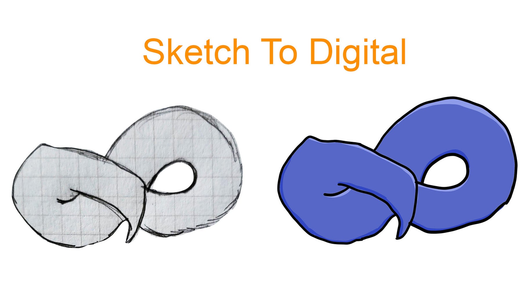
𝐇𝐨𝐰 𝐭𝐨 𝐓𝐮𝐫𝐧 𝐘𝐨𝐮𝐫 𝐒𝐤𝐞𝐭𝐜𝐡𝐞𝐬 𝐢𝐧𝐭𝐨 𝐃𝐢𝐠𝐢𝐭𝐚𝐥 𝐃𝐞𝐬𝐢𝐠𝐧𝐬


Step 1: Prepare Your Sketch

Finalize the Sketch

Make sure your sketch is clean and clear, with well-defined lines and few smudges.

Remove all unwanted marks to minimize effort while digitizing

Scan or Photograph the Sketch

Scan: Scan your sketch at a high resolution that is not less than 300 dpi

Photograph: Use a camera or a smartphone. Ensure good lighting, shadows should be low, and the angle is perpendicular


Step 2: Import the Sketch

Select Your Software

Popular software: Adobe Photoshop, Illustrator, Procreate, GIMP, or Krita.

Use vector graphics software such as Adobe Illustrator for vector designs or raster graphics software such as Adobe Photoshop for pixelated designs.

Import the File

Open your scanned or photographed sketch in your favorite software.

Tweak the brightness and contrast so that the lines are more apparent.


Step 3: Digitize the Sketch

Option 1: Trace the Sketch

Use a drawing tablet or pen tool to manually trace over your sketch. This method gives control over line quality and thickness.

In vector tools, use the "Pen" tool to create smooth, scalable paths.

Option 2: Use Auto-Trace Tools

Tools like Adobe Illustrator's Image Trace or Inkscape's Trace Bitmap can automatically convert your sketch into vector lines.

Adjust settings for line thickness, smoothness, and detail retention.


Step 4: Refine the Design

Clean Up Lines

Reshape uneven lines and fill gaps or overlaps using your software's tools - eraser, path smoothing, etc.

Add Layers

Divide elements: background, objects, text, etc.- for easier organization and flexibility.

Define Colors

Apply colors by using the Paint Bucket tool, gradient fills, or personal palettes. Ensure that layers for color and line art are separate to easily modify.


Step 5: Add Details

Textures and Effects

Textures, shading, and highlights give depth and realism.

Typography

Add text, if necessary, keeping it within the scope of the design's intention.

Final Tinkering

Filters, Blend Modes, Opacity


Step 6: Save and Export

File Types

Save the master file (PSD, AI) for later adjustments

Export as appropriate for usage:

JPEG, PNG: web, social media

SVG, EPS: scalable graphics, print ready

PDF: multi-page document or high resolution print

Resolution

72 dpi for web work

300 dpi or higher for print

Bonus Tips to Succeed

Invest in a Drawing Tablet: Wacom or iPads with Apple Pencil offer precision and natural drawing feel.

Use Brushes and Tools: Try digital brushes that mimic pencils, markers, or paint.

Practice Layering: Keep elements on separate layers for non-destructive editing.

Learn Keyboard Shortcuts: Familiarize yourself with shortcuts for efficiency.

"We Can Help You Build Your Website – Contact Us Now!"

Thursday, 23 January 2025

𝗛𝗼𝘄 𝘁𝗼 𝗗𝗲𝘀𝗶𝗴𝗻 𝗮𝗻 𝗘𝗳𝗳𝗲𝗰𝘁𝗶𝘃𝗲 𝗟𝗼𝗴𝗼: 𝗔 𝗦𝘁𝗲𝗽-𝗯𝘆-𝗦𝘁𝗲𝗽 𝗚𝘂𝗶𝗱𝗲


Step 1: Know Your Brand

But before diving into design, take the time to know your brand's identity.

Ask Questions:

  • What does your brand stand for?
  • Who is your target audience?
  • What emotions or values do you want to evoke?

Research Competitors:

Identify how competitors represent themselves and find a way to differentiate your logo.


Step 2: Select the Right Kind of Logo

Logos come in different styles. Choose the one that best fits your brand:

  • Wordmark (Text-based): E.g., Google, Coca-Cola.
  • Lettermark (Initials): E.g., IBM, HBO.
  • Symbol/Abstract Mark: E.g., Apple, Nike.
  • Combination Mark: A combination of text and symbols.
  • Emblem: A design where text is enclosed within a shape.


Step 3: Sketch Initial Ideas

  • Brainstorm freely using pen and paper.
  • Create as many rough drafts as possible.
  • Focus on shapes, text arrangements, and potential symbols that align with your brand's identity.


Step 4: Choose a Color Palette

Colors trigger emotions and are also one of the major perceptions of the brand:

  • Red: Passion, energy, excitement
  • Blue: Trust, reliability, calm
  • Green: Growth, health, nature
  • Yellow: Optimism, warmth, creativity

Choose colors that will express your brand message and be good both in color and black-and-white versions.


Step 5: Choose Your Fonts Wisely

Typography will define your brand

  • Serif Fonts: Classic, elegant, traditional
  • Sans-Serif Fonts: Modern, clean, approachable
  • Script Fonts: Sophisticated or casual depending on the font.

Ensure readability across various platforms.


Step 6: Refine and Digitize

  • Use graphic design software like Adobe Illustrator, Canva, or Figma to refine your sketches.
  • Experiment with layouts, proportions, and alignment for balance and symmetry.


Step 7: Test Scalability and Versatility

An effective logo works across all platforms and sizes:

  • Ensure it looks good in small sizes (e.g., on business cards) and large formats (e.g., billboards).
  • Test it on different backgrounds (light, dark, textured) to ensure versatility.


Step 8: Feedback

  • Distribute your logo to colleagues, friends, or a focus group.
  • Use that feedback to figure out where changes should be made.


Step 9: Save Final Versions of Logo in a Few Formats

  • Save your final logo in quality formats such as SVG, PNG, PDF, for the use cases mentioned above
  • Prepare color and B&W as well as the transparent background.


Conclusion:

Designing a logo is a creative and iterative process. Keep it simple, relevant, and unique to make your logo timeless. A good logo will be the foundation of your brand identity and help you leave a lasting impression.

"We Can Help You Build Your Website – Contact Us Now!"

𝐇𝐨𝐰 𝐭𝐨 𝐃𝐞𝐬𝐢𝐠𝐧 𝐚 𝐁𝐫𝐨𝐜𝐡𝐮𝐫𝐞 𝐓𝐡𝐚𝐭 𝐆𝐫𝐚𝐛𝐬 𝐀𝐭𝐭𝐞𝐧𝐭𝐢𝐨𝐧


1. Purpose and Audience

Define the Objective: Is the brochure meant for marketing, information, or education?

Know your audience: Design according to their preferences and demographics.

2. The Appropriate Format

Choose a brochure: bifolium, trifold, z-fold, or gate fold.

Determine that the format suits the volume of the content and objectified purpose.

3. Catchy Cover

Headline: Bright and bold with a strong message.

Visuals: A good-quality image, illustration, or graphic.

Less Clutter: Make it clean and attractive enough to prompt the user to dive deeper.

4. Visual Hierarchy

Highlight Important Content: Use bigger text, contrasting colors, and positioning.

Structuring: Divide content into categories with appropriate headings.

Great layout: Ensure proportion of text, images, and white space

5. Chosen Color Scheme

Use a color scheme that fits your brand identity

Use contrasting colors to make CTAs stand out or point attention to some important content

6. Typography

Select 2-3 fonts to provide variety, but not too much

Use text that is clear, and use size hierarchy for headings, subheadings, and body copy.

7. Include Quality Graphics

Use third-party professional photography or custom illustrations or vector graphics.

The graphics should relate to the message and audience.

8. Content Optimization

Brevity is best: Use short, highly impactful language

Use bullet points, infographics, and charts

Strong call to action (CTA).

9. Print Quality Matters

Use high resolution files to avoid pixelation.

Paper quality should be chosen according to the design theme. It could be glossy or matte.

Finish: Embossing, spot UV, or foil stamping

10. Test and Refine

Bring it out to your friends or your clients.

Check the readability, aesthetics, and impact of the design before printing.

 "We Can Help You Build Your Website – Contact Us Now!"


Tuesday, 21 January 2025

𝐇𝐨𝐰 𝐭𝐨 𝐂𝐫𝐞𝐚𝐭𝐞 𝐂𝐨𝐦𝐩𝐞𝐥𝐥𝐢𝐧𝐠 𝐕𝐢𝐬𝐮𝐚𝐥𝐬 𝐟𝐨𝐫 𝐌𝐚𝐫𝐤𝐞𝐭𝐢𝐧𝐠 𝐂𝐚𝐦𝐩𝐚𝐢𝐠𝐧𝐬


1. Know Your Audience

    Develop Buyer Personas

  • Know what your audience likes, who they are, and what hurts them.

    Research Preferences

  • Determine colors, styles, and imagery that will appeal to your audience based on their interests and behaviors.


2. Ensure Brand Consistency

    Utilize a Style Guide

  • Apply consistent colors, fonts, and logos to further establish brand identity.

     Maintain Tone and Mood

  • Visuals should be consistent with your brand's voice—whether professional, playful, or innovative.


3. Select Quality Imagery

    Utilize Professional Photography

  • High-resolution, authentic images resonate more than generic stock photos.

    Leverage Custom Graphics

  • Develop custom illustrations or infographics to help communicate complex data or ideas.


4. Optimize for Platform-Specific Requirements

     Consider Dimensions and Ratios

  • Make sure your visuals are suitable for each platform's requirements (e.g., square images for Instagram, horizontal banners for Facebook).

    Adapt Content Formats

  • Use GIFs, videos, and carousels to fit user behavior on specific platforms.


5. Focus on Storytelling

     Create Visual Narratives

  • Use sequential images or video to tell a story that emotionally connects with your audience.

     Highlight Benefits

  • Show how your product or service solves problems or enhances lives.


6. Color Psychology

    Strategic Color Selection

  • Use colors that elicit specific emotions or actions (e.g., red for urgency, blue for trust).

    Maintain Accessibility

  • Ensure text and visuals have enough contrast to be readable.


7. Typography Effect

     Highlight Key Messages

  • Use bold fonts for headlines and smaller, legible fonts for details.

     Avoid Overcrowding

  • Balance text and visuals to maintain a clean and engaging design.


8. Add Motion Elements

    Create Animated Graphics

  • Motion graphics or short videos catch attention more quickly than static visuals.

     Use Subtle Effects

  • Apply transitions or hover effects to make visuals interactive.


9. Test and Iterate

    A/B Test Visuals

  • Try out different designs to find out what works the best for your audience.


10. Leverage Design Tools

     Graphic Design Platforms

  • Tools like Canva, Adobe Creative Suite, and Figma help create professional visuals.

     Include AI Tools

  • Apply AI-powered tools for generating templates, background removal,    or image enhancements.


Conclusion

Engaging visuals form the basis of an effective marketing campaign. Through attention to audience preference, brand consistency, and creative storytelling, you are likely to produce visuals that do not only grab attention but convert too. Constantly test and improve your designs in relation to the trend and expectations of your target audience.


 "We Can Help You Build Your Website – Contact Us Now!"


Monday, 20 January 2025

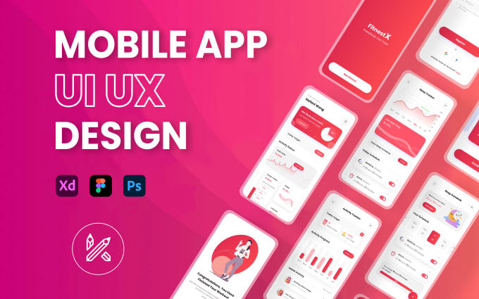
The Best Practices for Designing a Mobile App UI


1. Emphasize on Minimalism

  • Be neat and clean: Don't clog the space with too much information or content.
  • Use as little as necessary to get across the key feature.
  • Adopt the "one screen, one purpose" paradigm.


2. Establish a Consistent Design Language

  • Be consistent in terms of color usage, fonts, button styles, and spacing
  • Comply with platform-specific design guidelines
  • Material Design for Android
  • Human Interface Guidelines (HIG) for iOS


3. Design for Touch

  • Make all tappable elements touchable (greater than or equal to 48x48 pixels).
  • Keep interactive elements far enough apart so that accidental taps are unlikely.
  • Consider thumb-friendly zones, especially for one-handed use.


4. Visual Hierarchy

  • Use size, color, contrast, and alignment to guide the user's attention.
  • Make key actions stand out (e.g., "Buy Now" or "Login") with prominent buttons or bold colors.
  • Group related content in a logical way.


5. Accessibility

  • Use readable fonts (at least 16px for body text).
  • Provide sufficient contrast between text and background for readability.
  • Support screen readers and label all interactive items.
  • Add gestures for people who have motor impairment.


6. Flexible Design

  • User interface should display well on diverse screen sizes and resolutions.
  • Check designs on many devices to be sure they appear consistent and accessible.


7. Use Intuitive Navigation

  • Stay with the conventions, like a bottom navigation bar or side menus.
  • Avoid long navigation levels and confuse users
  • Use icons of meaning with text label


8. Reduce Load Time

  • Optimize images and videos to enhance performance.
  • Use loading animations or progress indicators to inform users of delay.


9. Provide Feedback for Actions

  • Use visual or tactile feedback when elements are interacted with (e.g., button press animations).
  • Use clear and actionable error messages and success confirmations.


10. Test and Iterate

  • Conduct usability testing on real users to identify issues and gather feedback.
  • Use A/B testing to figure out which design elements work best.
  • Continuously iterate and improve based on analytics and user input.


11. Use Animation Sparingly

  • Add animations to guide user actions and enhance the experience.
  • Avoid too many or unnecessary animations that may distract or slow down interactions.


12. Incorporate Personalization

  • Offer users customization options (e.g., themes or layouts).
  • Leverage data to provide personalized experiences, such as tailored recommendations.


13. Design for Offline Use

  • Plan for scenarios where users may have limited or no internet access.
  • Cache core data and give more relevant offline messages.


14. Scalability

  • Plan for future growth in features and content.
  • Ensure the UI can scale to accommodate additional functionality that doesn't compromise design integrity.


15. Security Best Practices

  • Avoid leaking sensitive data through the UI.
  • Provide feedback for secure actions like login or payment.

"We Can Help You Build Your Website – Contact Us Now!"

Thursday, 16 January 2025

How to Use Design to Build a Strong Brand Identity


1. Know Your Brand

Define your mission and vision. Clearly define what your brand stands for and what it is trying to achieve in the long run.

Know your audience. Research demographics, preferences, and pain points of your target customers.

Identify your unique value proposition (UVP). Highlight what makes your brand unique.

2. Define Core Brand Elements

Logo:

Keep it simple, versatile, and reflective of your brand's essence.

Ensure it's scalable for use across various platforms (digital, print, etc.).

Color Palette:

Select 3-5 core colors that trigger the right emotions (e.g., blue for trust, red for passion).

Use the same colors on all brand materials.

Typography:

Fonts that match your brand personality, such as modern, playful, or professional.

Keep a hierarchy using primary and secondary typefaces.

Imagery:

High-quality images, such as photos, illustrations, or icons, that fit the tone of your brand.

Style, such as minimalism, bold, or vintage, which is recognizable and consistent.

3. Create a Consistent Visual Language

Design templates. Develop templates for presentations, social media, and documents that can be reused.

Patterns and textures. Add unique graphic elements to your design.

Interactive elements. For digital assets, add animations or micro-interactions.

4. Reflect Your Brand Personality

Voice and tone. Your design should reflect your communication style (e.g., fun, formal, or empathetic).

Storytelling. Use visuals to tell your brand story well.

5. Apply Design Across Touchpoints

Website:

Design a user-friendly, visually appealing site with consistent branding.

Responsive design for mobile and desktop users

Social Media

Create consistent profiles with branded cover photos, profile images, and post templates

Use unique filters or styles for posts

Marketing Materials

Ensure brochures, flyers, and ads follow the same branding guidelines

Packaging

For physical products, design packaging that reflects your brand identity and stands out on shelves

6. Consistency

Brand guidelines. Develop a style guide outlining logo usage, color codes, typography, and image guidelines.

Audit regularly. Periodically review brand assets to ensure alignment across channels.

7. Feelings

Design for emotions. Your design should connect with customers emotionally, whether through inspiring visuals, nostalgic elements, or innovative layouts.

Create memorable experiences. Use unique design touches to leave a lasting impression (e.g., an unboxing experience).

8. Adapt and Innovate

Monitor trends. Stay updated with design trends while maintaining core brand identity.

Evolve thoughtfully. Rebrand or refresh designs as your business grows and with customer familiarity in mind.

"We Can Help You Build Your Website – Contact Us Now!"

How to Work with a Graphic Designer as a Client


1. State Your Goals and Vision

  • Before involving a designer, clearly know what you require. Identify your:
  • Objectives: What do you want the design to achieve? For example, boosting the recognition of your brand, improving the interaction of a user
  • Target audience: Whom are you trying to reach?
  • Inspiration: Gather examples of what designs, styles, or colors appeal most to your vision


2. Supply a Detailed Brief

  • A well-written design brief lays the foundation for success. Include:
  • Project scope: Deliverables, formats, and timelines.
  • Brand guidelines: Logos, color palettes, fonts, and tone of voice.
  • Key messages: What the design should communicate.
  • Budget: Clearly outline the financial parameters to avoid misunderstandings.


3. Communicate Clearly

  • Be transparent and open with communication. Be specific about:
  • What you like or dislike: Instead of vague feedback like "make it pop," specify, "I prefer a brighter color palette."
  • Deadlines and revisions: Ensure mutual agreement on timelines and the number of revisions allowed.


4. Trust the Designer’s Expertise

  • While your input is vital, trust your designer’s skills and experience. They understand design principles, audience psychology, and visual trends better than most clients. Give them the creative freedom to explore ideas.


5. Provide Constructive Feedback

When reviewing drafts:

  • Be timely: Avoid delaying feedback.
  • Be specific: Point out elements you want adjusted, such as font sizes or layout balance.
  • Be solution-oriented: Instead of saying, "I don't like it," suggest, "Could we try a more minimalist layout?"


6. Respect the Process and Timeline

  • Design is a creative process that requires time. Rushing may compromise quality. Be realistic about deadlines and understand that some revisions might take longer than anticipated.


7. Understand the Scope of Work

  • Clarify early on what is included in the project, such as:
  • Number of concepts to be presented.
  • Number of revisions allowed.
  • Ownership of design files after completion.


8. Honor the Designer’s Intellectual Property

  • Once the project is complete, ensure proper attribution if required. Refrain from altering their work without permission unless agreed otherwise.


9. Be Professional

  • Treat your designer as a collaborator, not a contractor. Mutual respect fosters a productive and enjoyable working relationship.


10. Celebrate the Results

  • When the project is done, express your gratitude for the designer's efforts. Acknowledge them publicly where appropriate, such as on social media, to further strengthen your relationship and establish good will for future collaborations.

"We Can Help You Build Your Website – Contact Us Now!"

Wednesday, 15 January 2025

How to Design a Custom Font for Your Brand


Step 1: Define Your Brand Identity

  • Brand personality: Decide whether the brand is formal, playful, modern, or traditional.
  • Know your audience: Consider what the target audience likes and expects.
  • Collect inspiration: Browse a set of fonts that have a visual style that is similar to your brand


Step 2: Select Font Characteristics

  • Type of font: serif, sans-serif, script, or display; consider which type suits your brand requirements best.
  • Key attributes: Choose weight, height, spacing, and curves that match your brand voice.
  • Usage needs: Consider how the font will be used, such as for a logo, website, or print materials.

Step 3: Draw Letterforms

  • Hand-drawn letters: Draw letterforms by hand on paper or by using a drawing tablet. First, sketch the key letters, such as "a," "b," "g," "m," and "n."
  • Try out variations: Play with different styles and thicknesses to see what feels right.
  • Refine shapes: Shortlist your options and details that give the font its personality.

Step 4: Employ Font Design Software

  • Select appropriate tools: Common tools are:
  • Adobe Illustrator (for initial vector designs).
  • Glyphs or FontForge (for font creation).
  • Digitize sketches: Employ vector paths to create clean, scalable designs.
  • Design all characters: Create a full character set, including letters, numbers, and punctuation.

Step 5: Refine the Font

  • Check consistency: Make sure all characters have the same ratio and styling.
  • Adjust spacing and kerning: Refine character spacing for maximum readability.
  • Test scalability: Preview how the font will look in different sizes, on different screens, and so forth.

Step 6: Test Your Font

  • Mockups: Apply the font to brand elements such as logos, business cards, or even websites to check how it holds up.
  • Feedback: Share your design with other colleagues or even test groups for feedback.

Step 7: Finalize and Export

  • Export formats: Save your font in common formats like.OTF or.TTF for use across platforms.
  • Licensing: If using any pre-existing elements, ensure you have proper licensing.

Step 8: Deploy and Protect

  • Brand guidelines: Include the font in your brand guidelines with instructions on appropriate usage.
  • Trademark: Consider trademarking your custom font to prevent unauthorized use.

"We Can Help You Build Your Website – Contact Us Now!"

Tuesday, 14 January 2025

How to Design for Sustainability in Graphic Design


Designing for sustainability in graphic design is making choices that benefit the environment and society. Here are some key principles and tips for creating sustainable designs:

1. Use Eco-Friendly Materials
  • Print: Use recycled paper, or paper certified by FSC (Forest Stewardship Council). Avoid glossy finishes, which often involve harmful chemicals.
  • Packaging: Opt for biodegradable or recyclable packaging for your designs, especially for products.

2. Reduce Waste
  • Efficient Layouts: Develop designs that require minimal usage of ink or other materials. For instance, reduce the use of colors or even the amount of space in printing to conserve resources.
  • Digital-first Approach: Prioritize digital design solutions that eliminate the generation of unnecessary products to become waste.

3. Design for Longevity
  • Timeless Aesthetics: Steer clear of fads that are sure to pass by quickly. Opt for designs that are time-defying and don't have to be done frequently.
  • Scalable Designs: Design in such a way that it can easily be adapted to future use or different formats without a complete overhauling process.

4. Use Sustainable Colors
  • Eco-friendly Inks: If printing is required for your designs, use vegetable-based inks or other eco-friendly inks available.
  • Colors with Less Resource Use: Dark colors require less amount of ink while printing than lighter colors, and thus help conserve resources.

5. Reduce Energy Consumption
  • Optimize for Web: Design files for the web to load as fast as possible, saving energy while in use.
  • Efficient Software Use: Work with tools that consume less energy or are designed to be more eco-efficient.

6. Social Good
  • Social Messaging: Utilize your platform to raise awareness about sustainability, climate change, and other relevant issues. Designs that inspire good actions can last a lifetime.
  • Collaborate with Sustainable Brands: Work with companies that align with your values, promoting their environmentally-friendly initiatives through your design work.

7. Design for Reusability
  • Modular Design: Create designs that are reusable, such as logos or templates that can easily be updated or repurposed in the future.
  • Repurposing Old Designs: Recycle previous design work, incorporating older elements into new projects instead of starting from scratch.

8. Choose Digital Over Physical
  • Where possible, choose digital designs that don't require any kind of physical production and shipping. These include online advertisements, websites, or e-books.

Conclusion
Sustainable graphic design means being responsible with the choices that will minimize adverse environmental impacts. Eco-friendly materials, optimizing designs, and the promotion of sustainability in your work are ways to create a more sustainable future in the design industry.
 

Friday, 10 January 2025

The Benefits of Freelance Graphic Design


1. Artistic Autonomy

  • Select Your Work Assignments: Freelancers may accept work assignments that best suit their style or interest.
  • You are free to materialize your imagination and ideas without any firm constraints or company preferences.
  • Variety of Work Assignments: Projects may range from brand identity to advertising, web design, and illustrations.

2. Flexible Work Environment

  • Work Anywhere: Depending on your personal preference, be it at home, a co-working space, or while on the move, freelancers have the flexibility to work from wherever they feel convenient.
  • Set Your Hours: One can create their preferred time schedule, even if they're a morning bird or a nightingale.
  • Work-Life Balance: Freelancing creates an opportunity for better management of personal and professional commitments.

3. Unlimited Earning Potential

  • Set Your Rates: Freelancers are free to charge what they feel their work is worth.
  • Multiple Clients: Unlike a full-time role, you can work with multiple clients simultaneously, diversifying income streams.
  • Upselling Services: Offer add-ons like social media graphics, animations, or website design to increase earnings.

4. Personal and Professional Growth

  • Skill Development: Working on varied projects hones your skills and keeps you updated with the latest design trends and tools.
  • Entrepreneurial Experience: Managing your business teaches valuable skills like client communication, invoicing, and time management.
  • Portfolio Building: Freelancers can create a versatile and robust portfolio, showcasing their range and expertise.

5. Autonomy and Control

  • Be Your Own Boss: Make decisions about your work, clients, and processes without external interference.
  • Custom Workflow: Use tools and methods that suit your style and efficiency.
  • Direct Client Interaction: Build relationships directly with clients, allowing for clearer communication and better understanding of project goals.

6. Global Opportunities

  • Access to a Global Market: A freelancer can work with clients from all over the world, hence making them experience cultures and industries.
  • Remote Collaboration: Tools such as Zoom, Trello, and Figma easily make it possible to work remotely with international clients.

7. Job Satisfaction

  • Variety of Work: Projects tend to be diverse, meaning work remains engaging and boredom is avoided.
  • This sense of accomplishment results from seeing the real designs in action, such as on websites, advertisements, or products.
  • Direct Impact: Your work often directly influences a client’s brand identity and success.

8. Potential for Long-Term Success

  • Building a Personal Brand: Freelancers can establish a recognizable brand that attracts high-quality clients.
  • Passive Income Streams: Over time, freelancers can create assets like templates, online courses, or design tools to generate additional income.
  • Client Retention: Satisfied clients often return with more work or recommend your services to others.


9. Cost-Effective Career

  • Low Startup Costs: With a computer, design software, and an internet connection, you’re ready to start.
  • No Commute: Save time and money by working from your preferred location.
  • Tax Benefits: Freelancers can deduct expenses like software, equipment, and home office costs from their taxes.


10. Networking and Collaboration

  • Expand Your Network: Collaborate with clients, other designers, or professionals in related fields like marketing and development.
  • Grow Your Reputation: Quality work and professional communication can lead to referrals and testimonials.
  • Access to Online Communities: Behance, Dribbble, and LinkedIn connect you with fellow creatives and potential clients.


Tips for Thriving as a Freelance Graphic Designer

  • Build a Strong Portfolio: Highlight your best work and tailor it to attract your ideal clients.
  • Market Yourself: Utilize social media, a personal website, and freelance platforms like Upwork or Fiverr to showcase your skills.
  • Set Clear Contracts: Ensure all agreements include deliverables, timelines, and payment terms.
  • Stay Updated: Continuously learn new tools and techniques to stay competitive in the industry.

𝐓𝐡𝐞 𝐈𝐦𝐩𝐨𝐫𝐭𝐚𝐧𝐜𝐞 𝐨𝐟 𝐀𝐥𝐢𝐠𝐧𝐦𝐞𝐧𝐭 𝐢𝐧 𝐆𝐫𝐚𝐩𝐡𝐢𝐜 𝐃𝐞𝐬𝐢𝐠𝐧

  A perfect alignment will provide a good basis for most graphics designs so as to create harmonious, readable, and professional visual resu...